As we approach Early Access launch, we’re mostly focused on bug fixes and performance gains. Our art team, however, has been focused on upgrading the UI and menus in Techtonica.
UI is extremely important. We’ve all played games where menus were clunky and frustrating. Tweaking these elements and making them user-friendly while still looking rad is a difficult task, and our art team tackled it well. We previously covered the HUD UI update here; give it a read if you’re interested!
Today, we’ll share some more UI upgrades and dive into the thought process behind our UI design.
Let’s get to it.
The Inventory Menu Overhaul
The original menus were developed for our pitch demo. They supported different mechanics, many of which we tested and scrapped over the course of early prototyping. The art team was also developing the art style for the rest of the game which was going through fast and furious iterations. As both the art style and set of mechanics solidified, it became obvious that we had to update our UI to suit not only the new designs, but also the new story and narrative content.
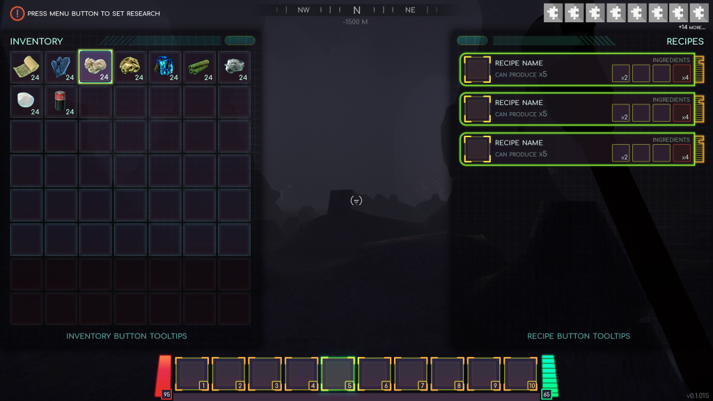
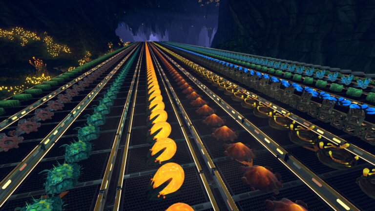
Some features in this screenshot have been nixed… Like the health and energy bars from when we had survival mechanics!
The inventory and schematics menus are actually still pretty similar to the early designs (and will be undergoing a visual overhaul sometime in the future), but when you compare them to the new layout, it’s still pretty different.
There’s a ton of info relating to both the resources and recipes in Techtonica, and there were a bunch of decisions to be made in terms of what exactly to show the player and what to keep in the background. It’s pretty common to hear, “Oh, we should be showing that number, too,” during development. While squeezing in another line of info can work from time to time, it’s much easier to design a robust UI system that supports these types of changes.
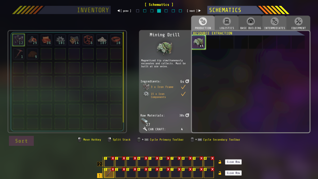
The new inventory menu has organized the information needed in a much more efficient manner, cleaned up the fonts and color scheme, and added a lot more detail.
In the future, Techtonica’s inventory menu will look something like this.

While some of the features won’t be available for Early Access launch, eventually players will see machine statistics like throughput, fuel consumption, and more in their inventory menu.
Settings, Settings, and More Settings
Below is the old settings menu from our first demo.. featuring a placeholder name for Techtonica while we started design!
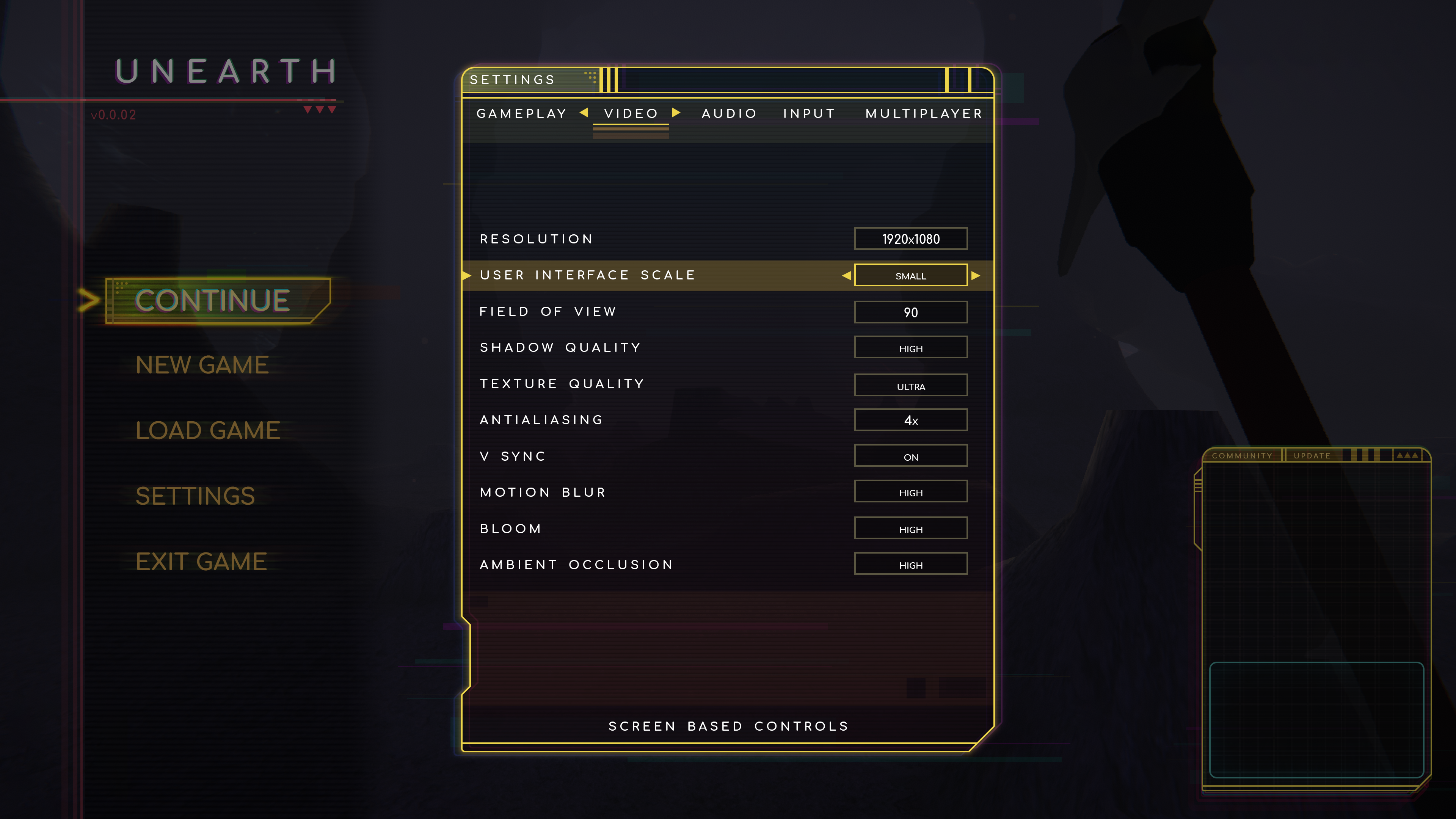
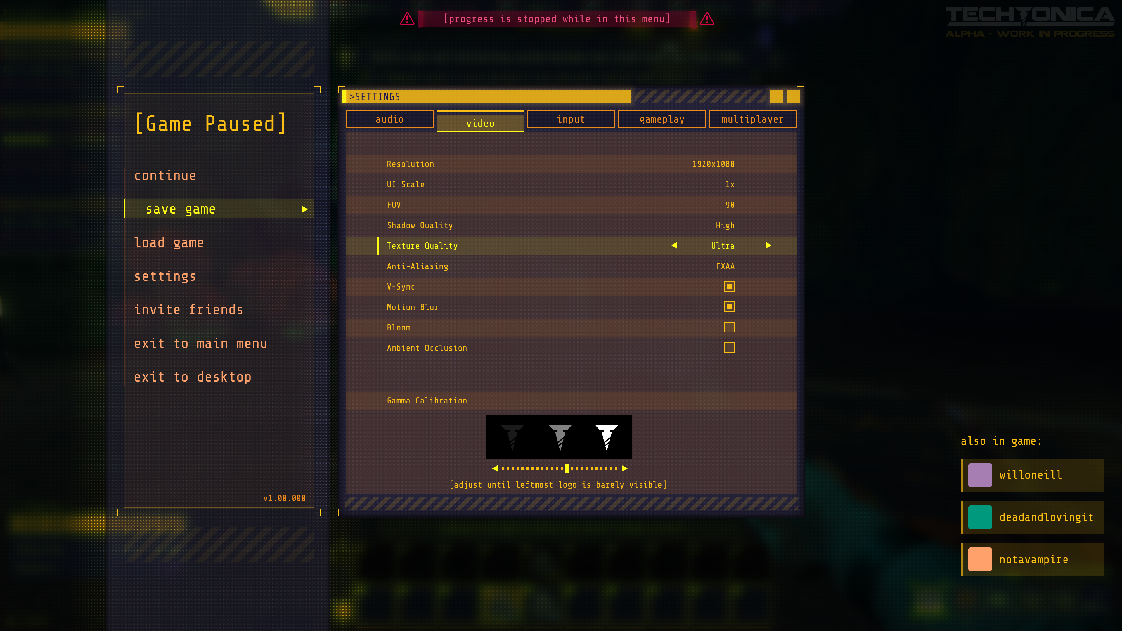
While this looks clean, it was no longer representative of our current layouts and design, and we needed more options. Our current Settings Menu (with lots of new options) is below!
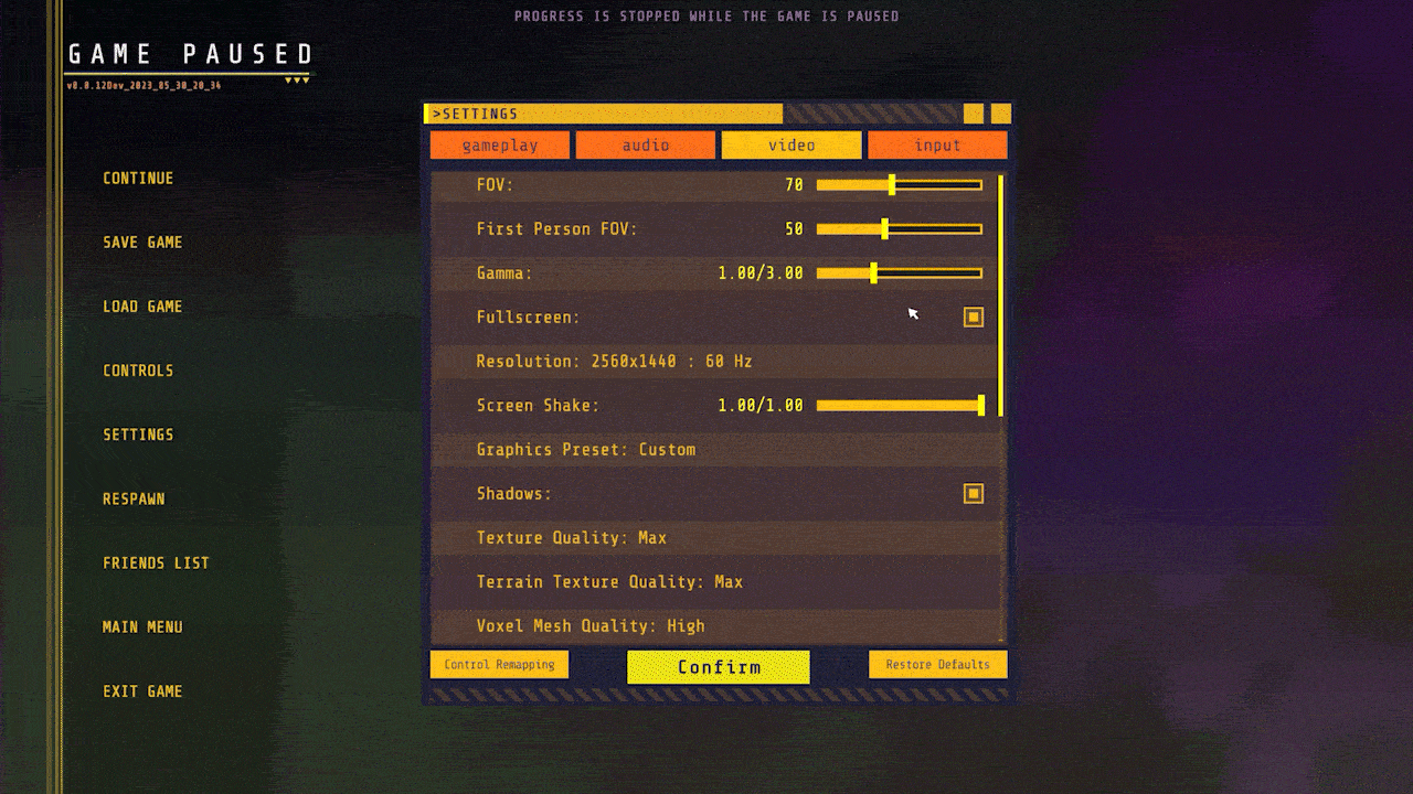
For the settings menu, we tried to be conscious of different gaming setups as well as accessibility for all of our players.
Eventually, our settings menu will look more like this:
Unlocking Satisfaction
Finally, a fun UI effect we recently added is the unlock animation for terminals. Every time you repair a terminal, you get a really cool effect that we will improve over time.
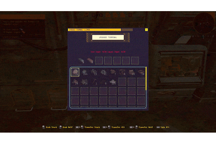
We wanted to make the player feel excited about repairing the production terminal, and what better way to do that than a full-screen animation?
Finally, we’ve got some big news.
The demo is being removed from Steam on June 9th.
With Early Access launch on the horizon, it’s time to say goodbye to the demo. It’s no longer representative of the game we’re launching into Early Access this summer.
If you’d like to chat more about the UI or what’s coming to Techtonica, join our Discord.
Until next week.